“Better code, better life. ”
前言
呜啦啦啦啦啦~
又来写博客咯
正文
点击使用Jupyter nbviewer查看代码
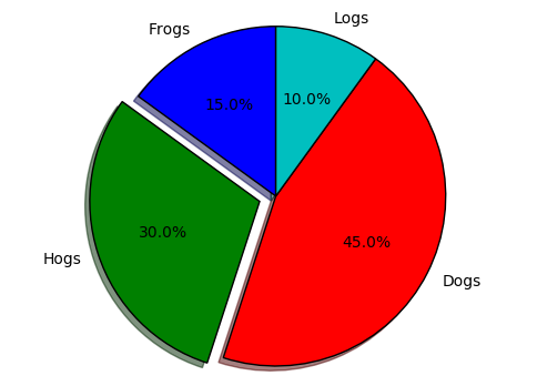
1. 首先是比较常用的饼状图
import matplotlib.pyplot as plt

labels = 'Frogs', 'Hogs', 'Dogs', 'Logs'
sizes = [15, 30, 45, 10]
explode = (0, 0.1, 0, 0)
#这个explode是指将饼状图的部分与其他分割的大小,这里之分割出hogs,度数为0.1,这个数字表示和主图分割的距离
fig1, ax1 = plt.subplots()
ax1.pie(sizes, explode=explode, labels=labels, autopct='%1.1f%%',
        shadow=True, startangle=90)
ax1.axis('equal')
#这个equal是让整个饼图为一个圆形,如果不加,则是椭圆形
plt.show()
2. 下面是另外一种很神奇的可以显示矩阵的图
import numpy as np
import matplotlib.pyplot as plt


fig, ax = plt.subplots()

# vc=[1,2,39,0,8]
# vb=[1,2,38,0,8]
# image = np.corrcoef(vc, vb)
np.random.seed(0)
image = np.random.uniform(size=(6, 6))
# print (image)
ax.imshow(image, cmap=plt.cm.gray, interpolation='nearest',origin='upper')
ax.set_title('dropped spines')
# Move left and bottom spines outward by 10 points
ax.spines['left'].set_position(('outward', 10))
ax.spines['bottom'].set_position(('outward', 10))
# Hide the right and top spines
ax.spines['right'].set_visible(False)
ax.spines['top'].set_visible(False)
# Only show ticks on the left and bottom spines
ax.yaxis.set_ticks_position('left')
ax.xaxis.set_ticks_position('bottom')

plt.show()
#image是一个6*6的矩阵,此类型的图可以显示矩阵数字的大小,颜色越浅,说明这个位置的数组越大
#举个栗子
print(image[2][1])
print(image[2][2])
#是不是很神奇 [滑稽]
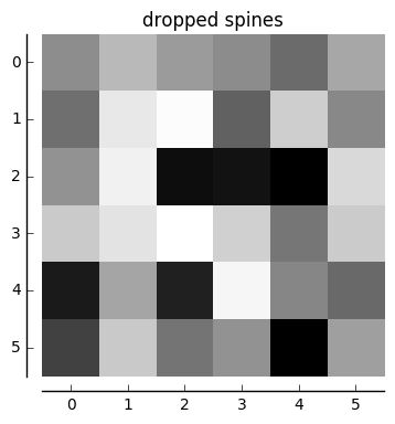
0.925596638293
0.0710360581979
3. 下面来用这种图显示各种股票之间的相关性的大小
点击下载股票收盘价
获取数据的代码
import pandas as pd
from numpy import mean, multiply, cov, corrcoef, std


df = pd.read_csv('matplotlib3.csv')
df.rename(columns={'Unnamed: 0':'date'},inplace=True)
df.head()
| date | 601939.XSHG | 601398.XSHG | 600519.XSHG | 000858.XSHE | 601166.XSHG | 600036.XSHG | |
|---|---|---|---|---|---|---|---|
| 0 | 2017-01-03 | 5.49 | 4.43 | 334.56 | 33.97 | 16.24 | 17.96 |
| 1 | 2017-01-04 | 5.49 | 4.43 | 351.91 | 35.19 | 16.32 | 18.02 |
| 2 | 2017-01-05 | 5.49 | 4.44 | 346.74 | 35.21 | 16.33 | 18.10 |
| 3 | 2017-01-06 | 5.46 | 4.44 | 350.76 | 35.38 | 16.17 | 17.96 |
| 4 | 2017-01-09 | 5.47 | 4.46 | 348.51 | 35.72 | 16.24 | 17.94 |
4. 先来补习一下相关的两个数学知识,协方差和相关系数的计算
b=[1,3,5,6]
print (np.cov(b))
print (sum((np.multiply(b,b))-np.mean(b)*np.mean(b))/3)
4.916666666666666
4.91666666667
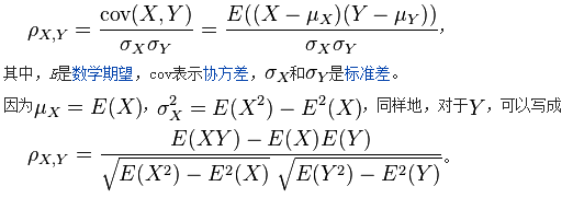
vc=[1,2,39,0,8]
vb=[1,2,38,0,8]
print (mean(multiply((vc-mean(vc)),(vb-mean(vb))))/(std(vb)*std(vc)))
#corrcoef得到相关系数矩阵(向量的相似程度)
print (corrcoef(vc,vb))
0.999986231331
[[ 1.          0.99998623]
 [ 0.99998623  1.        ]]
5. 画图
l = []
for x in df.columns[1:]:
    l.append(df[x].values)
matrix = np.mat(l)
image = corrcoef(matrix)
fig, ax = plt.subplots(figsize=(8, 8))
ax.imshow(image, cmap=plt.cm.gray, interpolation='nearest',origin='lowwer')
ax.imshow?
ax.set_title('dropped spines')
# Move left and bottom spines outward by 10 points
ax.spines['left'].set_position(('outward', 10))
ax.spines['bottom'].set_position(('outward', 10))
# Hide the right and top spines
ax.spines['right'].set_visible(False)
ax.spines['top'].set_visible(False)
# Only show ticks on the left and bottom spines
ax.yaxis.set_ticks_position('left')
ax.xaxis.set_ticks_position('bottom')
plt.xticks([0, 1, 2, 3, 4, 5],df.columns[1:])
plt.yticks([0, 1, 2, 3, 4, 5],df.columns[1:])
plt.show()
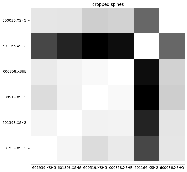
图中显示越浅的颜色说明对应的数字越大,即相关性越强
具体表现为股票在走势上高度一致
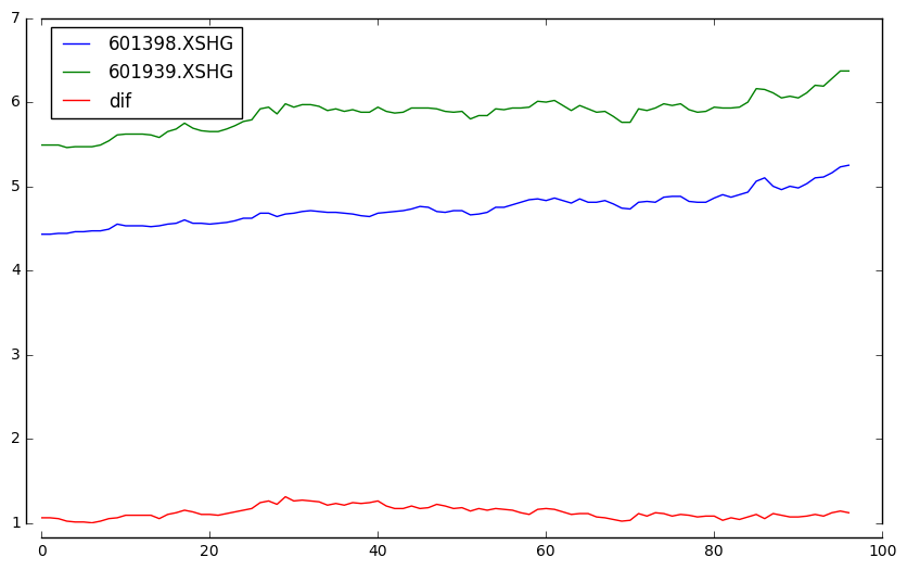
6. 下面画出工行和建行今年的走势
fig, ax = plt.subplots(figsize=(10, 6))
plt.plot(df.index, df['601398.XSHG'], label='601398.XSHG')
plt.plot(df.index, df['601939.XSHG'], label='601939.XSHG')
plt.plot(df.index, df['601939.XSHG']-df['601398.XSHG'], label='dif')
plt.legend(loc='upper left')
ax.spines['left'].set_position(('outward', 10))
ax.spines['bottom'].set_position(('outward', 10))
plt.show()
后记
打完收工!
—— Simon 于2017.6